Easy Checks for Web Accessibility
This guide provides ESDC development teams with easy steps to spot & fix basic accessibility issues, get ready for the IT accessibility office (ITAO) audit, save time and reduce rounds of review needed to address accessibility gaps.
General
-
The page has a title that describes the page content and purpose.
Ensure the page title is descriptive and provides an accurate summary of the page content. This can be set using the
<title>tag within the<head>section of your HTML document.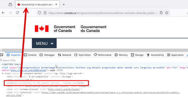
The inspect element window highlights the title tag, which references the title displayed at the top of the webpage. An arrow points from the HTML tag to the matching title on the webpage. -
Using semantic HTML to mark up the structure of the page and represent the information, rather than relying on custom CSS.
Check the code to see if correct HTML elements are used to structure the content based on each element's meaning, and not its appearance. Examples: Headings should use semantic HTML like
<h1>instead of using CSS to style the text to look like an<h1>, and lists should use semantic list HTML like<ul>and<ol>instead of using bullets to style the text to look like a list. -
The page has accurate and informative headings that are structured using
<h1> - <h6>heading tags without skipping hierarchical levels.Use an automated accessibility checker like Accessibility Insights for Web or use axe DevTools to check heading hierarchy and structure issues and ensure headings are accurate and informative. For more informations, consult Quick Assess in Accessibility Insights for Web
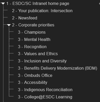
A well-structured heading hierarchy using <h1>,<h2>, and<h3>tags, represented using a tree view. -
Pages remain functional and readable when text is magnified to 200% of its initial size.
Zoom the page to 200% on a 1280 by 1024 viewport, and make sure that no content or functionality is lost, or that any text is clipped, truncated, or obscured.
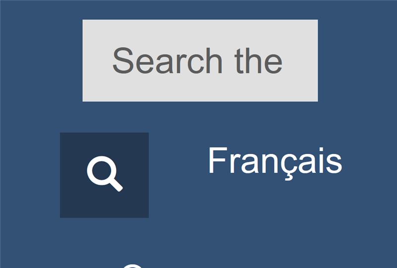
The label text does not fit within the search input field, causing the text to be truncated. -
Page content reflow does not cause loss of content or functionality and does not require horizontal scrolling when the viewport width is set to 320px.
Use a mobile devices simulator such as Toggle device toolbar in Chrome Dev Tools to verify. Open the developer tools in your browser and use responsive design mode. Set the viewport width to 320px by narrowing the browser window or by zooming in so that the viewport width is now 320px. To do this when starting with a 1280px viewport width at 100% browser zoom, zoom in to 400%. Ensure no text is clipped or content disappears.
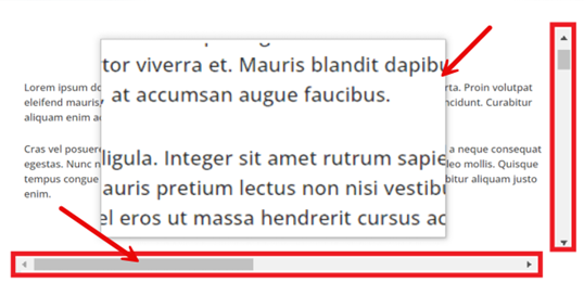
Zoomed-in text with scrollbars highlighted. Arrows point to the horizontal scrollbar and the zoomed-in content's borders to show the relationship between these elements. -
The primary language of the page is set using
langattribute and using a standard language code. (e.g.<html lang="en">or<html lang="fr">).Identify passages or phrases in a language different from the main language of the page. Then, check the code to make sure that any changes in language are marked using the
langattribute.
The lang attribute is highlighted within the inspect element window, showing that this is an English page with the "en" lang attribute applied. -
All text elements and non-text elements have sufficient color contrast between the foreground and background color.
Use the Colour Contrast Analyzer tool or an online contrast checker
- Text and images of text should have a contrast ratio of at least 4.5:1 between any text (and images of text) and the background behind the text.
- Non-textual elements should have a minimum contrast ratio of 3:1 with adjacent colours.
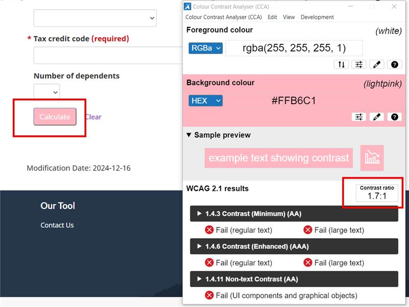
A page where a button with a pink background and white text is highlighted. The pink and white color combination is being tested using a colour contrast analyser tool, with alerts notifying the user that this combination fails to meet the necessary contrast ratio. -
Inline language changes are marked up and have valid
langattribute values. (e.g.lang="en"orlang="fr").Identify passages or phrases in a language different from the main language of the page. Then, check the code to make sure that any changes in language are marked using the
langattribute.
An inspect element view showing a langattribute applied to a specific tag, differentiating it from the main language of the webpage. Thelangattribute is highlighted in red, with an arrow pointing to the corresponding text associated with this tag on the webpage. -
The purpose of each link can be understandable from the link text.
Check to see if link labels give a clearer idea of what user can expect to find by clicking on the link.
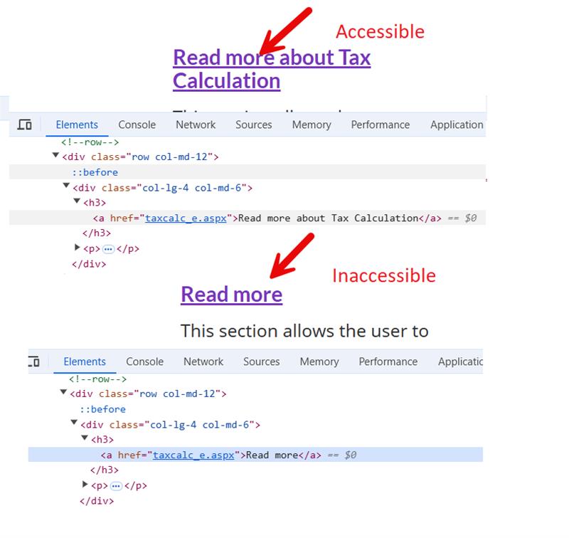
Two examples of hyperlink text, with one example labelled accessible (“Read more about Tax Calculation”) and the other inaccessible (“Read more”). The link tag for each has been highlighted in the inspect element window.
Keyboard
-
The navigation order of focusable elements (e.g., links, form elements, modal dialogs, etc.) is logical and intuitive, preserving the meaning and operability of the content.
Navigate through the page using Tab or Shift + Tab to ensure that the tabbing order makes sense according to the content on the webpage. Best practices recommend that the tab order follows the reading order of the webpage for improved accessibility.
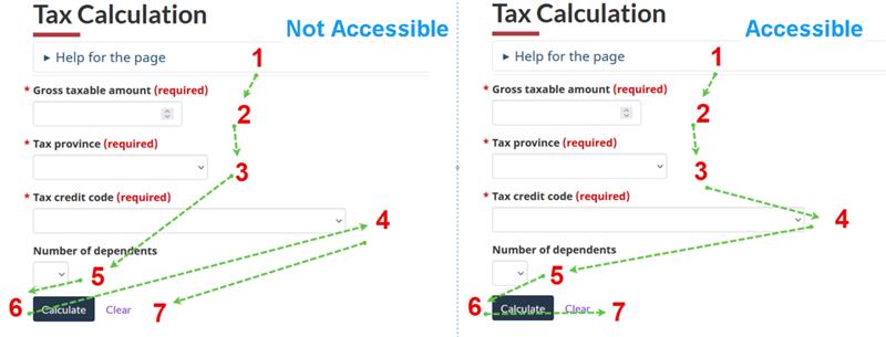
Instructions on structuring the tab order of a webpage. Two examples are presented: one demonstrating an accessible and logical tab sequence, and the other showcasing an inaccessible, disorganized sequence. -
All focusable elements show a visual focus indicator when in focus and do not disappear while tabbing.
Navigate through the page using Tab or Shift + Tab to ensure that focusable elements have a clear, visible indicator that identifies visual focus.
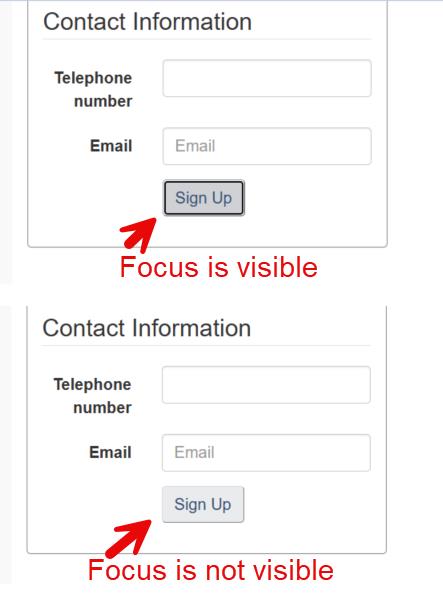
Two examples of buttons demonstrating a principle of accessibility. The first example shows a button where the focus is visible when focused, making it accessible. In the second example, the focus is not visible, making the button inaccessible. -
The page has a keyboard-accessible method to bypass repetitive content.
Using the keyboard keys, check if there is a list of links to skip blocks of repeated material.
Example: The first interactive item on the page is a link (titled Skip to Main Content) to the beginning of the main content. Activating the link sets focus to the main content.

A tag link highlighted in the inspect element window with an arrow pointing to the top of the webpage, indicating the corresponding “Skip to main content” link which enables users to skip to the main content. -
Keyboard access and control are available for all interactive components that have mouse access and control.
Ensure that all elements such as links, form fields, buttons, and media player controls are accessible and operable using only the keyboard keys.
- Use the
Tabkey to navigate in a linear direction through focusable elements like links, form controls, and buttons. - Use the
Enterkey (and sometimesSpace) to select an element. - Use the Arrow keys to move within certain elements, element groups, and widgets, such as form select elements, radio button groups, and sets of tabs.

A user interface displaying multiple elements such as selectable fields, buttons, and links, with arrows indicating the tabbing sequence between elements. - Use the
Images and Multimedia
-
Informative images have a text alternative that serves the equivalent purpose.
Check the code to see if the image has
altattribute and ensure its value contains appropriate alternative text that describes the purpose of the image in a way that adequately substitutes for the image.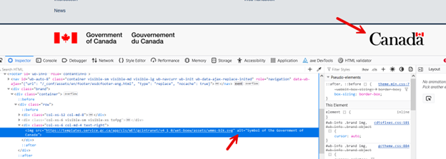
Within the inspect element window, an arrow points to the alternative text of an image, describing a symbol of the Govermenet of Canada. This demonstrates how alternative text provides a brief and meaningful description of the image for accessibility. -
Decorative images are coded in such a way that screen readers can ignore them.
Check the code to see if the image has
altattribute and ensure the value is empty (alt="").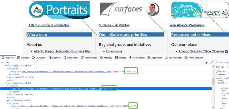
The inspect element window displaying HTML code for three decorative images. The sections of code demonstrating that each image’s alt text is empty have been highlighted in green. -
Pre-recorded multimedia (video) content has captions.
Look to see if captions are available for both video and audio content, either through open captions (captions that are always on and that cannot be turned off) or closed captions (look for a closed captions button or a way to turn on captions).

A screencapture of a video displaying captions that correspond to the host's speech. Displayed within the video is an image of the 'Job Bank Canada' website
Forms
-
All form elements (e.g. text fields, checkboxes, radio buttons, drop-down menus etc.) have descriptive and meaningful labels.
Use an automated accessibility checker like Accessibility Insights for Web - Fast Pass or use axe DevTools in Chrome or Firefox. Running a scan of the page will automatically detect any errors.
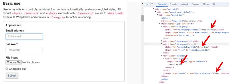
A form page with the inspect element window to its right. Arrows point to each descriptive label field. -
Labels or instructions are provided when content requires user input.
Check the code to see if any fields are marked as required. If an asterisk (*) symbol is used to indicate a required form field, instructions must also be provided to define the meaning of the symbol at the top of the form.
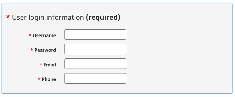
A form legend with a label indicating that the fields are required. -
Error messages clearly identify where the issue occurred (e.g., field name) and what needs to be corrected.
Check to see if error messages are easy to understand and provide clear instructions on how they can be resolved.
Example: "Please enter your name" is not as helpful as "Please enter your first name".
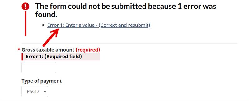
An arrow pointing to an error message indicating that a field cannot be left empty and instructing the user to enter a value. The error text above the input field is highlighted in red.