Designing for users with low vision
This page was archived on January 23, 2026. The information is provided for reference, research, or recordkeeping purposes. For current information, please visit Designing for users with low vision - Digital Accessibility Toolkit.
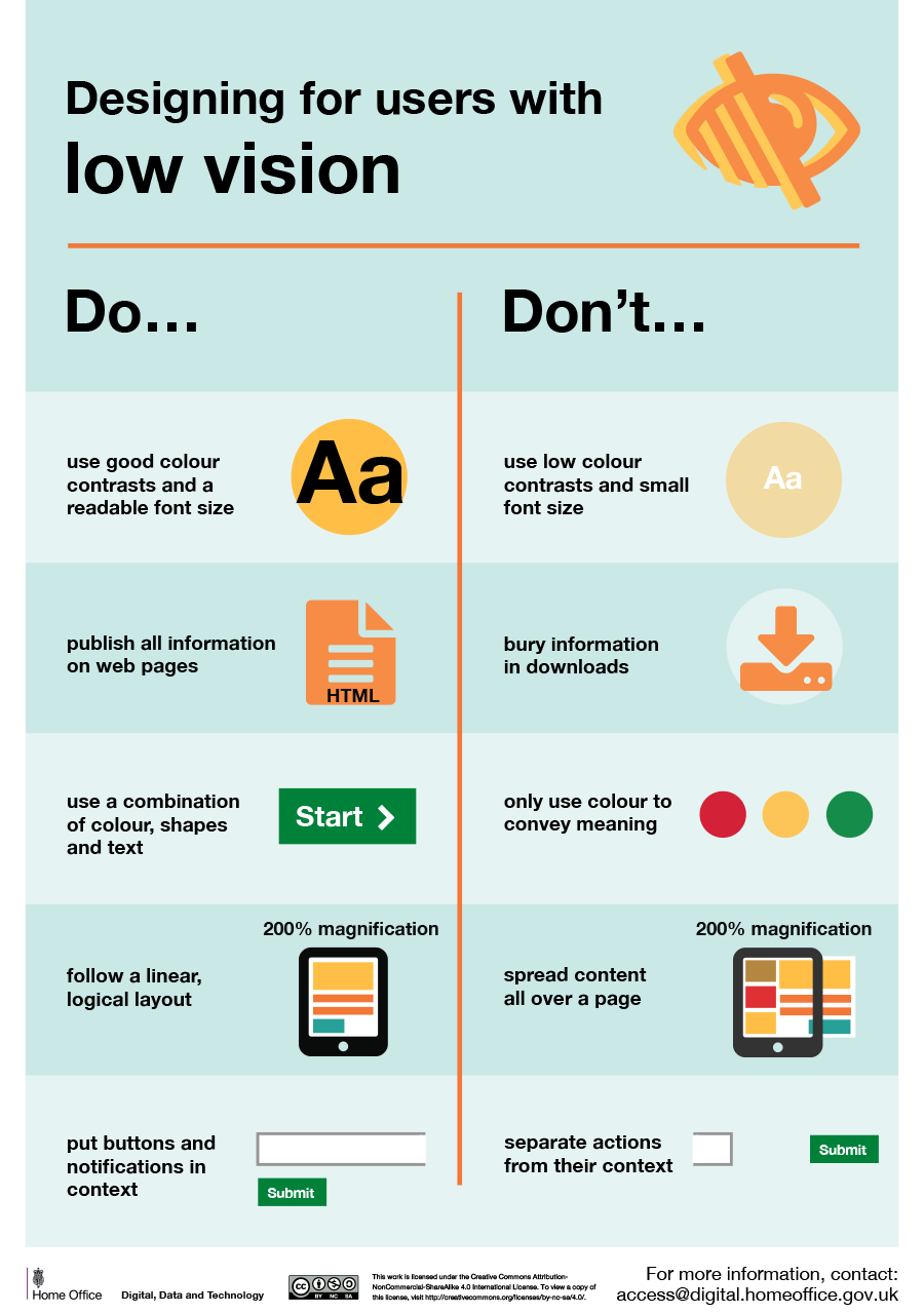
Long Description
Designing for users with low vision
Do...
- Use good colour contrasts and a readable font size
- Publish all information on web pages
- Use a combination of colour, shapes and text
- Follow a linear logical layout
- Put buttons and notifications in context
Don't...
- Use low colour contrasts and small font size
- Bury information in downloads
- Only use colour to convey meaning
- Spread content all over pages
- Separate actions from the context
For more information, contact: access@digital.homeoffice.gov.uk