Navigation
Blocks of navigation
Semantically identify the important blocks of navigation on a page with either the <nav> element or the role="navigation" attribute. Each creates an ARIA navigation landmark, which screen reader users can target by keyboard command.
If there are two or more navigation regions on the page, name each with aria-label or aria-labelledby to differentiate them.
Indicating the current link within a block of navigation is an example of an easily achievable WCAG Level AAA Success Criterion. It requires two things:
- style the current link to stand apart visually, and
- set an
aria-current="page"attribute on the link. The attribute must be set on the link since it tends only to work on actionable elements.
Good example: Pagination
Here, a pagination menu for search results is set in a named nav element. The current link is indicated visually via the CSS, and to screen readers via the aria-current="page" attribute.
CSS
Code begins
.current-page {
   background-color: #ccc;
   border: 1px solid black;
}
Code ends
HTML
Code begins
<nav label="Results by page">
   <ul>
      <li>
         <a href="[…]" aria-label="page 1">1</a>
      </li>
      <li class="current-page">
         <a href="[…]" aria-current="page" aria-label="page 2">2</a>
      </li>
      <li>
         <a href="[…]" aria-label="page 3">3</a>
      </li>
      <li>
         <a href="[…]" aria-label="page 4">4</a>
      </li>
   </ul>
</nav>
Code ends
Related WCAG resources
Related WCAG resources
Success criteria
- 1.3.1: Info and Relationships
- 2.4.8: Location (Level AAA)
Techniques
Skip navigation links
On a poorly-designed website, keyboard users must navigate from the top of the page to the main content area, often through a long list of navigation links and other elements. This can take be tedious and even painful for users with some forms of motor disabilities.
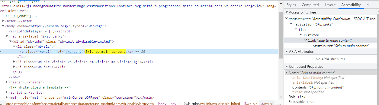
A skip navigation link enables screen reader users and sighted keyboard users to navigate directly to the main content from the top of the page.
A skip link isn’t needed if only a handful of controls separate the main content from the top of the page.
Follow these best practices for skip navigation links:
- Place the skip navigation link at the top of the page before any other focusable element (link, button, or custom control).
- The skip link doesn't need to be visible until it receives focus.
- Use clear link text – e.g. "Skip to Main Content" or "Skip to Content"
- Use a same-page link, targeting the
idattribute value of the destination (usually the<main>element). - Assign the destination the
tabindex="-1"attribute. This fixes shortcomings in some browsers that move the viewport to the destination but not the focus. - Do not hide the skip link using any of these CSS options:
- Use CSS to permanently position the link off screen
- Set
display: none - Set
visibility: invisible
HTML
Code begins
<body>
   <a id="skip-nav" class="show-with-focus" href="#main-content">Skip To Content </a>
      [...]
   <main id="main-content" tabindex="-1">Main Content Goes Here</main>
</body>
Code ends
CSS
Code begins
.show-with-focus {
   position: absolute;
   left: -1000px;
   top:-1000px;
   width: 1px;
   height: 1px;
   text-align: center;
   overflow: hidden;
}
.show-with-focus: focus, .show-with-focus: active {
   position: absolute;
   left: 0;
   top: 0;
   width: auto;
   overflow: visible;
   background-color: #FF3;
   border: 1px dotted #000;
}
Code ends
Good example: Skip to main content
Example begins
Example ends
Related WCAG resources
Related WCAG resources
Success criteria
Techniques
- G1: Adding a link at the top of each page that goes directly to the main content area
- G123: Adding a link at the beginning of a block of repeated content to go to the end of the block
- G124: Adding links at the top of the page to each area of the content
- SCR28: Using an expandable and collapsible menu to bypass block of content
Multiple ways
Provide more than one way to locate a Web page within a set of Web pages. Users may find one technique easier or more comprehensible to use than another.
Use two or more of the following techniques:
- Provide links to navigate to related Web pages.
- Provide a Table of Contents.
- Provide a site map.
- Provide a search function to help users find content.
- Provide a list of links to all other Web pages.
- Link to all of the pages on the site from the home page.
Exception: Note that this WCAG criterion doesn't apply if the web page is the result of, or a step in, a process.
Related WCAG resources
Related WCAG resources
Success criteria
Techniques
Use two or more of the following techniques:
Table of contents
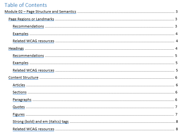
A table of contents serves two purposes:
- It acts as an overview of the document’s main topics and so allows users to preview the content without having to scroll down and read or skim.
- It allows readers to navigate directly to a specific section of the document.
The table of contents for a page should reflect the heading structure of the page.
A table of contents is particularly helpful to sighted users with motor disabilities, blind users and keyboard users.
WCAG Success Criterion 2.4.5: Multiple Ways requires that users have multiple avenues for finding web pages on a site. Navigation blocks, search, site maps, or a table of contents can support this Level AA criterion.
Good example: Table of contents
In this example, a screenshot of a table of contents shows heading text as links. Headings of levels 1, 2 and 3 are included.
Example begins
Example ends
Related WCAG resources
Related WCAG resources
Success criteria
Techniques
Meaningful sequence
Screen readers read content directly from the DOM (a page’s underlying code after JavaScript has modified it), not the actual screen. They ignore any CSS rules. It’s possible to use CSS (floats, positioning, margins, and padding) to achieve a visual reading order that’s meaningful while under the hood, the reading order of the underlying code (top to bottom) doesn’t make sense. See the example in Failure F1, in Related WCAG resources, below.
Remove CSS styling to simulate the screen reader experience. The content should make sense, reading top to bottom.
To ensure a meaningful reading order, position content in the same sequence as the underlying code.
Related WCAG resources
Related WCAG resources
Success criteria
Techniques
- G57: Ordering the content in a meaningful sequence
- C6: Positioning content based on structural markup
- C27: Making the DOM order match the visual order
Failures
Focus and focus order
What is focus?
Focus refers to which interactive control on the screen -- a link, form control, button, or custom control -- currently receives input from the keyboard (and from the clipboard when you paste content).
Focus determines where keyboard events go in the page. For instance, if you focus a text input field and start typing, it receives the keyboard events and displays the characters you type. While it has focus, it also receives pasted input from the clipboard. Some of the native controls even have additional keyboard support built in. For instance, with the select element focused you can press the Up and Down arrow keys to select different children, and start typing to auto-complete to one of the available items.
An item with focus also has what’s called a visual focus indicator or focus ring. The style of it depends on the browser or the styling applied by the page author. Firefox, for instance, displays a dashed border, whereas Chrome highlights focused elements with a blue border.
For keyboard users, focus is absolutely critical. It’s the equivalent of a mouse cursor, and it's how they reach all of the interactive controls in an application.
Not all elements are focusable. Non-interactive elements like images, paragraphs, divs, and various other page elements are not focused as you tab through the page. This is by design, as users have no need to focus on something if they can't interact with it.
Focus order
Keyboard users navigate from interactive item to interactive item using the Tab key, in sequential order, following what’s called the focus order. They use the Shift-Tab keys to move backwards in the focus order. Like reading order, focus order is determined by the Web page’s source order. The order of interactive items (links, buttons, form controls and custom controls) in the DOM is the order in which they’re encountered by keyboard users.
The keyboard navigation order must be logical and intuitive. Typically, this means ensuring the navigation follows the visual flow of the page, left to right, top to bottom. It moves through the banner, main navigation, page navigation and controls, then footer on a typical page.
Focus order can be confounded by JavaScript. When JavaScript inserts new content, the content should follow the triggering element, not precede it. Screen reader users will not expect new content to fall before the trigger. Module 10’s section Focus management with JavaScript-injected content goes into greater detail.
Built-in interactive HTML elements – links, buttons and form controls – are implicitly focusable, meaning they receive focus by default without additional markup.
To receive focus, a link must have a populated href attribute.
To prevent a link from receiving focus, remove its href attribute.
To prevent a button or form control from receiving focus, add the Boolean "disabled" attribute. When present, it makes the element not mutable, focusable, or submitted with the form. The user can neither edit nor focus on the control, nor its form control descendants. You can also prevent a control from gaining focus by giving it a tabindex="-1" attribute.
Custom links and controls require a tabindex="0" attribute to receive focus. See Good example: Inserting a custom link into the tab order, below, for all the CSS, HTML attributes and JavaScript required to emulate a link. Important: When possible use a built-in HTML element instead of building a custom control with ARIA.
The tabindex attribute
The tabindex attribute is mostly used as a means of managing focus within widgets.
- A
tabindexattribute value of 0 puts the element in the focus order, at its current location in the DOM. - A
tabindexvalue of -1 removes an interactive element from the focus order, but enables it to be targeted by script (and changed) using itsfocus()method. For instance, with the Tabs widget, only one tab at a time may be in the tab order: the selected tab hastabindex="0", while the inactive tabs havetabindex="-1". The tabindex values change as the keyboard user navigates across the tabs, using the Arrow keys to set focus on a new tab. See the description of the Tabs widget in module 12. - A
tabindexvalue greater than 0 is almost always a bad idea and should be avoided. It moves the element to the beginning of the page’s focus order, and is encountered in ascending order with any other positivetabindexvalues. Positivetabindexvalues are difficult to maintain and brittle, and their use tends to confound user expectations of focus order. Instead, write the document with the elements in a logical sequence. See Bad example: Page design with positive tab index values, below.
Good example: Inserting a custom link into the tab order using tabindex="0"
In the example below, press the Tab to move focus forward from link to link, and the Shift-Tab keys to move focus backwards.
The third link is a custom link:
- The
tabindex="0"attribute adds the<span>element to the focus order. - The
role="link"attribute identifies it to screen reader users. - The
class="link"attribute enables styling to match default links and to provide a highly-visible keyboard focus indicator. - The
clickevent handles mouse and touch input. - The
keydownevent handles Enter key input.
View HTML
Code begins
<a href="http://www.bing.com" class="link">Bing</a>
<a href="http://www.duckduckgo.com" class="link">DuckDuckGo</a>
<span
   tabindex="0"
   role="link"
   class="link"
   onclick="goToLink(event, 'http://www.google.ca/')"
   onkeydown="goToLink(event, 'http://www.google.ca/')">
      Google
</span>
View CSS
Code begins
<style type="text/css">
   .link:focus, .link:hover {
      outline: 3px solid orange;
   }
   span.link {
      cursor: pointer;
      color: #0000EE;
      text-decoration: underline;
   }
   span.link:active {
      color: #FF0000;
   }
</style>
Code ends
View Javascript
Code begins
<script type="text/javascript">
   function goToLink (event, url) {
      var type = event.type;
      if ((type === 'click') || (type === 'keydown' && event.keyCode === 13)) {
         window.location.href = url;
         event.preventDefault();
         event.stopPropagation();
      }
   }
</script>
Code ends
The custom link JavaScript is from the Web Accessibility Initiative (WAI) document: Link Examples in the Link pattern of the WAI-ARIA Authoring Practices 1.1. Matt King, JaEun Jemma Ku, James Nurthen, Zoë Bijl, Michael Cooper. Copyright © 2019 W3C® (MIT, ERCIM, Keio).
Element with tabindex = "-1"
A tabindex="-1" attribute value removes the element from the focus order, but allows it to receive programmatic focus. This means focus can be set to it using the element’s JavaScript focus() method.
Good example: Element with tabindex="-1" receives focus by script
In this example, clicking the button sets focus on the div element.
Example begins
Example ends
HTML
Code begins
<button type="button" onclick="document.getElementById('target').focus();">
   Click on me to focus the DIV
</button>
<div id="target" tabindex="-1">
   I am a div
</div>
Code ends
Element with tabindex > "0"
Using a tabindex attribute value greater than 0 is considered an anti-pattern.
Any tabindex greater than 0 jumps the element to the front of the natural tab order. If there are multiple elements with a tabindex > 0, then the tab order starts from the lowest value greater than zero and works its way up.
Positive tabindex values often create counter-intuitive flow for keyboard users. If you want an element to come sooner in the tab order, move it to an earlier spot in the DOM rather than set a positive tabindex value.
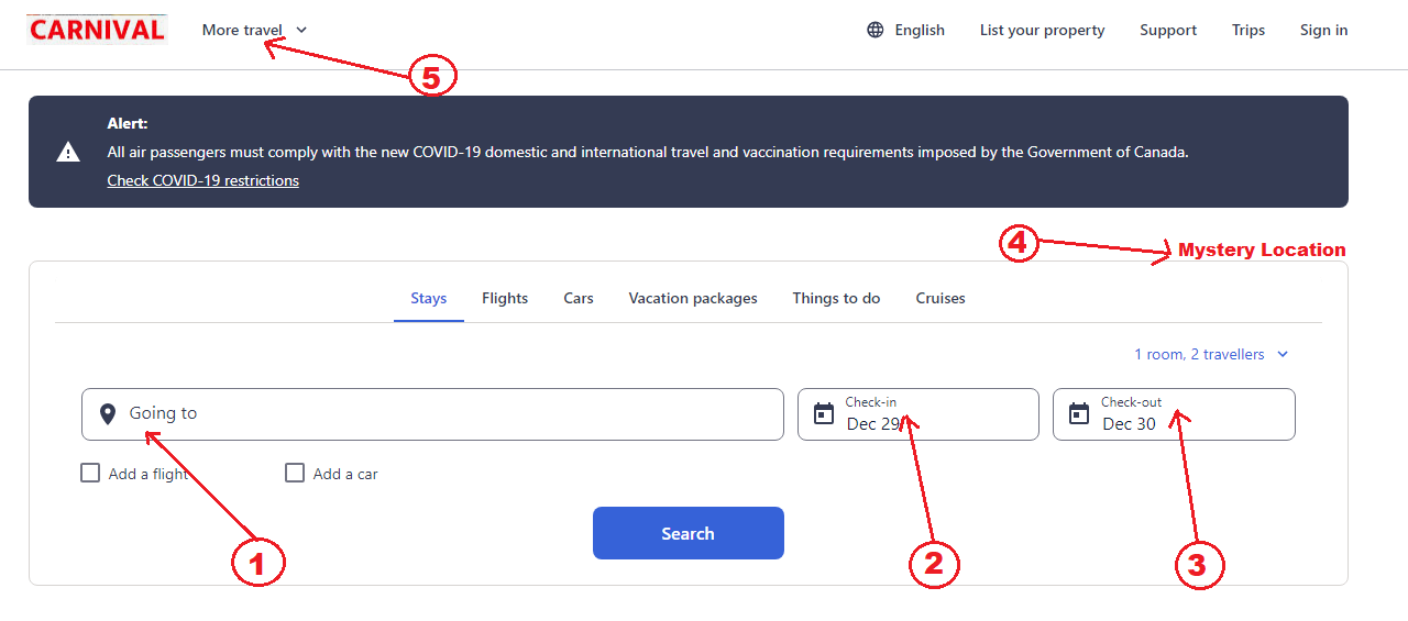
Bad example: Page design with positive tab index values
The tab order when user tabs the page is as follows:
- The "Going to" field (
tabindex="1") - The "Check-in" field (
tabindex="2") - The "Check-out" field (
tabindex="3") - A mystery object that has no functionality, and no visible focus indicator (
tabindex="4") - "More travel" and then follows the natural tab order (
tabindex="0").
Example begins
Example ends
The positive tabindex is set on just four items in the "Carnival" page. After navigating through the positive tabindex values, keyboard users are sent back to the top, to the first focusable control on the page at the beginning of the natural tab order.
A visually hidden item is in the tab order on the page, creating a "mystery" focus that can lead to confusion. If something is visually hidden, it must not be in the tab order.
Avoid using tabindex values greater than 0. Instead, write the document with the elements in a logical sequence. Ensure the source code (DOM) order matches the visual order to avoid confusion for assistive technology users.
Related WCAG resources
Related WCAG resources
Success criteria
Techniques
- G59: Placing the interactive elements in an order that follows sequences and relationships within the content
- C27: Making the DOM order match the visual order
- H4: Creating a logical tab order through links, form controls, and objects
- SCR26: Inserting dynamic content into the Document Object Model immediately following its trigger element
- SCR27: Reordering page sections using the Document Object Model
- SCR37: Creating Custom Dialogs in a Device Independent Way
Failures
Character key shortcuts
A keyboard shortcut is a terrific convenience for most, but it's a severe barrier for some users with disabilities if the shortcut doesn't include a non-printable key (e.g., Ctrl, Alt). Just by talking, voice input users will unintentionally trigger a shortcut consisting only of letter keys, since their speech input is converted by the software into a string of letters. Users who are prone to accidentally hitting keys will also trigger the shortcut.
WCAG Success Criterion 2.1.4: If a keyboard shortcut is implemented in content using only letter (including upper- and lower-case letters), punctuation, number, or symbol characters, then at least one of the following is true:
- Turn off
- A mechanism is available to turn the shortcut off;
- Remap
- A mechanism is available to remap the shortcut to include one or more non-printable keyboard keys (e.g., Ctrl, Alt);
- Active only on focus
- The keyboard shortcut for a user interface component is only active when that component has focus.