Responsive design
Overview – Responsive design
Responsive web design uses HTML and CSS to automatically resize, hide, shrink, or enlarge a website, ensuring the design looks good and the information and functionality are preserved across devices of all screen size.
CSS media queries
The technique leverages CSS “media queries”, which run tests to determine users’ screen size then serve distinct layouts to different screen widths. A typical strategy targets the three broad categories of device display: large screens, tablets and phones. The HTML and CSS of the page’s components are tailored to avoid introducing horizontal scrolling, as described in later sections.
The points at which a media query is introduced, and the layout changed, are known as “breakpoints”. This is the syntax:
CSS
Code begins
@media media type and (condition: breakpoint) {
   // CSS rules
}
Code ends
Media types available for media queries include:
- all
- for all devices
- for printers
- screen
- for computer screens, including tablets, phones, etc.
- speech
- for screen readers
Breakpoints
Good example: Single breakpoint
In this example , the media type is screen and the breakpoint is 480px. If the width of a device is 480px or smaller the .button style rule is applied.
CSS
Code begins
@media screen and (max-width: 480px) {
   .button { background-color: red; }
}
Code ends
Government of Canada breakpoints
The Government of Canada Treasury Board Secretariat Technical specifications for the Web and mobile presence specifies two breakpoints for large and small screens at 768 pixels.
These media queries target the “screen” type, so their rules are not applied to print output.
CSS
Code begins
@media screen and (min-width: 768px) {
   /* styles for large screen device */
}
@media screen and (max-width: 767px) {
   /* styles for small screen device */
}
Code ends
WET breakpoints
The Web Experience Toolkit boasts a mobile friendly responsive design. It implements the Bootstrap 3 breakpoints:
- Extra extra small – below 480px
- Extra small - between 480px to 768px
- Small – between 768px to 992px – Mobile size
- Medium – between 992px to 1200px – Tablet size
- Large – between 1200px to 1600px – Desktop size
- Extra large – larger than 1600px
Common breakpoints
Small (phones)
- 320px – 480px: Mobile devices
Medium (tablets)
- 481px – 768px: iPads, Tablets
Large (desktops)
- 769px – 1024px: Small screens, laptops
- 1025px – 1200px: Desktops, large screens
- 1201px and more – Extra-large screens
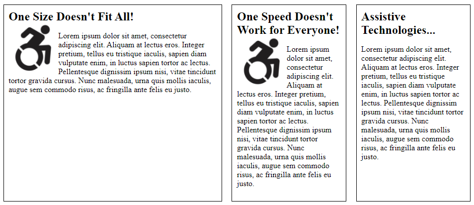
Good example: Reflow content
See this example in action (Opens in new tab). Narrow your browser window to trigger the responsive layout.
View screenshots of the responsive layout
Desktop: @media (min-width:960px)
Example begins
Example ends
Tablet: @media (min-width:481px) and (max-width:959px)
Example begins
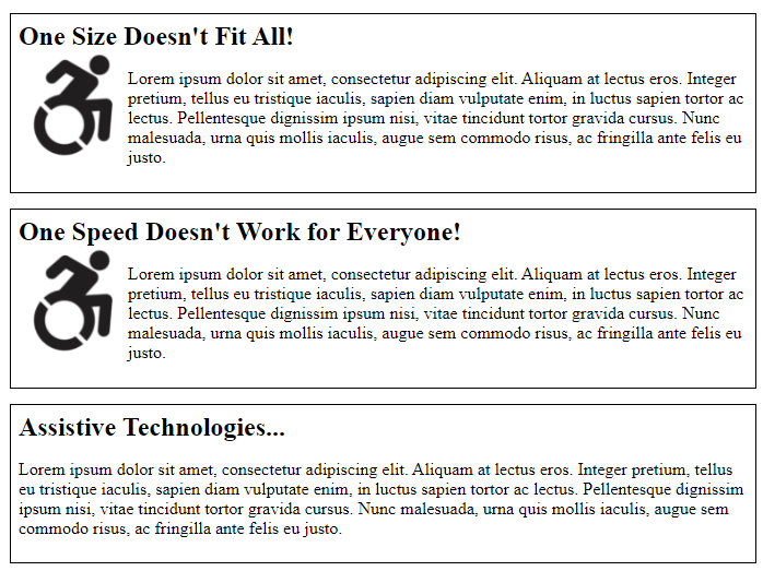
Example ends
Phone: @media (max-width:480px)
Note that the float is removed from the images.
Example begins
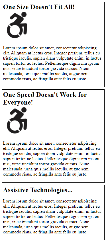
Example ends
View HTML
Code begins
<article>
   <header>
      <h1>Responsive Tips...</h1>
   </header>
   <div class="columns">
      <section id="a">
         <h2>One Size Doesn't Fit All! </h2>
         <img src="images/a11yicon.jpg" alt="Accessibility icon">
         <p>Lorem ipsum dolor sit amet</p>
      </section>
      <section id="b">
         <h2>One Speed Doesn't Work for Everyone! </h2>
         <img src="images/a11yicon.jpg" alt="Accessibility icon">
         <p>Lorem ipsum dolor sit amet</p>
      </section>
      <section id="c">
         <h2>Assistive Technologies... </h2>
         <p>Lorem ipsum dolor sit amet</p>
      </section>
   </div>
</article>
Code ends
View CSS
Code begins
article {
   margin: 0 auto;
}
header {
   margin: 0 auto;
   text-align: center;
}
.columns {
   display: flex;
   flex-wrap: wrap;
}
section {
   background-color: white;
   color: black;
   border: 1px solid black;
   padding: 1%;
   margin:1%;
}
h2 {
   margin: 0;
}
section img {
   width: 100px;
   float: left;
}
@media (min-width:960px) {
   article {
      width:960px;
   }
   #a {
      flex: 2;
   }
   #b {
      flex: 1;
   }
   #c {
      flex: 1;
   }
}
@media (min-width:481px) and (max-width:959px) {
   article {
      width:100%;
   }
   #a, #b, #c {
      flex:100%;
   }
}
@media (max-width:480px){
   article {
      width:100%;
   }
   section img {
      float: none;
   }
   #a, #b, #c {
      flex:100%;
   }
}
Code ends
Set the viewport
Pages optimized for a variety of devices must include a <meta> element in the <head> of the document, specifying a couple of properties of the viewport. A meta viewport tag instructs the browser on how to control the page’s dimensions and scaling. A page is not responsive on mobile devices without it.
HTML
Code begins
<html lang="en">
   <head>
      […]
      <meta name="viewport" content="width=device-width, initial-scale=1">
   </head>
Code ends
The width=device-width parameter instructs the page to match the device’s screen width. This allows the page to reflow content to match different screen sizes.
The initial-scale parameter sets the default zoom level of the page. Setting it to initial-scale=1 instructs browsers to establish a 1:1 relationship between CSS pixels and viewport pixels. This property is needed in large part to address a resizing and content-clipping bug in some devices triggered by using width=device-width and viewing the page in landscape orientation.
Mobile pages must support the pinch-to-zoom feature to enable users to enlarge small text and controls and to compensate for poor contrast. To enable the pinch-to-zoom feature, set user-scalable=1 and maximum-scale=2.0. That’s a 200% value, the minimum zoom required to meet WCAG. You can enable greater zoom by setting maximum-scale to a higher value, or by removing the maximum-scale parameter to remove the zoom limit entirely.
Good example: Pinch-to-zoom set to 200% magnification
In this example, the page is configured to allow a maximum 200% zoom via the maximum-scale property. 200% is the minimum zoom value required by WCAG.
HTML
Code begins
<meta name="viewport" content="width=device-width, initial-scale=1.0, maximum-scale=2.0; user-scalable=1">Code ends
Bad example: Disabling pinch-to-zoom
Developers often disable the pinch-to-zoom feature by setting two parameters on the meta viewport element: user-scalable=no and maximum-scale=1.0.
HTML
Code begins
<meta name="viewport" content="width=device-width, initial-scale=1.0, maximum-scale=1.0; user-scalable=no">Code ends
Viewport emulators
You can test breakpoints using viewport emulators to accurately represent your media query and style, bearing in mind that emulators don't represent the functionality or the features of the browser.
You can also test breakpoints using the online service Viewport Emulator, as per the example below.
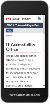
Good example: Checking the IT Accessibility Office using the Viewport Emulator
In this example, the IT Accessibility Office is tested using the online Viewport Emulator.
Example begins
Example ends
Good example: Checking the IT Accessibility Office using the Chrome emulator
Chrome mobile emulator can be accessed through its developer tools options by using keyboard shortcuts: Command + Option + I (Mac) OR Ctrl + Shift + I (Windows).
Example begins
Example ends
Benefits to low vision users
Many users with low vision can’t magnify small screens well enough to read them. Instead, they read sites on large devices and magnify the screen. As the user magnifies, the browser window grows smaller relative to the size of the content, eventually triggering CSS breakpoints for smaller screen layouts. On a large device, a small screen layout optimized to display as a single column can take up the entire width of the large screen, enabling quite large text.