Responsive tables
Designing responsive tables
Wide tables that overflow the viewport are not responsive. It is difficult for users to remember what information they’re looking at if the row and column headers scroll out of view. Follow these tips to help prevent overflow:
- Use percentage instead of fixed pixels to set the width of columns and tables
- Break large or wide tables into multiple small or narrow tables
- Display a horizontal scroll bar if the table overflows the screen (overflow example)
- Make tables more narrow by:
- Reducing the number of columns
- Merging columns
- Using acronyms or abbreviations for long words
- Inserting soft hyphen markup
­to break long words
- Transform tables at small viewports to prevent horizontal scrolling (reflow example)
Note that WCAG success criterion 1.4.10: Reflow exempts data tables from content reflow. It is acceptable to provide scrolling for data tables. The Canada.ca design system and WET do not include any functionality to transform and reorganize tables, as shown as in the examples below.
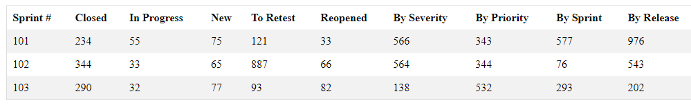
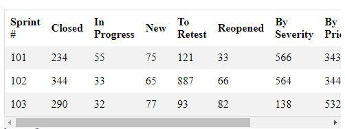
Good example: Overflowing table with focusable horizontal scrollbar
In this example, a large overflowing table forces a horizontal scrollbar on the parent <div> element, generated by the CSS declaration overflow-x: auto. The <div> takes the tabindex="0" attribute, to ensure the scrollbar receives keyboard focus (as per the W3C-WAI ACT rule Scrollable element is keyboard accessible). Since the <div> is a tab stop, we identify it to screen reader users with a name (the table caption "Sprints" via aria-labelledby) and a role ("group").
It’s always preferable to break large tables into multiple smaller tables.
Example begins
| Sprint # | Closed | In progress | New | To retest | Reopened | By severity | By priority | By sprint | By release |
|---|---|---|---|---|---|---|---|---|---|
| 101 | 234 | 55 | 75 | 121 | 33 | 566 | 343 | 577 | 976 |
| 102 | 344 | 33 | 65 | 887 | 66 | 564 | 344 | 76 | 543 |
| 103 | 290 | 32 | 77 | 93 | 82 | 138 | 532 | 293 | 202 |
Example ends
HTML
Code begins
<div style="overflow-x:auto;" tabindex="0" role="group" aria-labelledby="tbl-caption">
   <table>
      <caption id="tbl-caption">Sprints</caption>
      […]
   </table>
</div>
Code ends
View screenshots
Desktop
Mobile
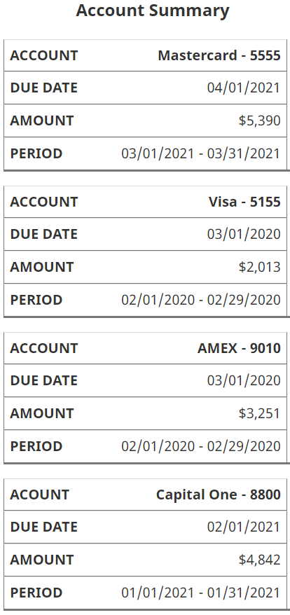
Good example: Reflow table to nested list
In the example below, there are two separate structures - a list and a table. But only one is visible on the screen at a time. The table transforms to a nested list if the width of the browser is less than 768 pixels. The nested list stays within the viewport to avoid horizontal scrolling.
Resize the browser window to see the effect.
Example begins
| Accounts | Due Date | Balance | Statement Date |
|---|---|---|---|
| Mastercard - 5555 | 04/01/2021 | $5,390 | 03/01/2021 - 03/31/2021 |
| Visa - 5155 | 03/01/2020 | $2,013 | 02/01/2020 - 02/29/2020 |
| AMEX - 9010 | 03/01/2020 | $3,251 | 02/01/2020 - 02/29/2020 |
| Capital One - 8800 | 02/01/2021 | $4,842 | 01/01/2021 - 01/31/2021 |
Account Summary
- Mastercard – 5555
- Due date: 04/01/2021
- Balance: $5,390
- Statement date: 03/01/2021 - 03/31/2021
- Visa – 5155
- Due date: 03/01/2020
- Balance: $2,013
- Statement date: 02/01/2020 - 02/29/2020
- AMEX – 9010
- Due date: 03/01/2020
- Balance: $3,251
- Statement date: 02/01/2020 - 02/29/2020
- Capital One – 8800
- Due date: 02/01/2021
- Balance: $4,842
- Statement date: 01/01/2021 - 01/31/2021
Example ends
View screenshots of the responsive layout
Desktop
Example begins
Example ends
Mobile
Example begins
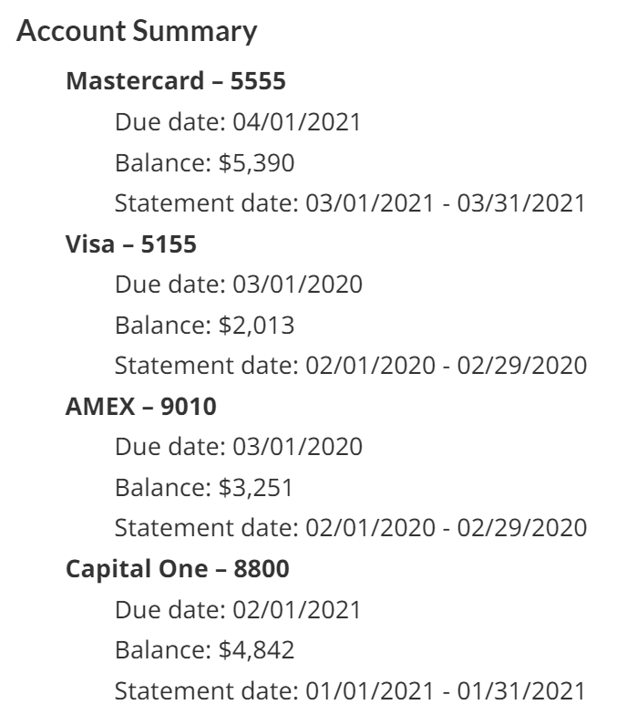
Example ends
View CSS
Code begins
#desktop-table {
    display:none;
}

#mobile-list {
    display:block;
}

#mobile-list ul {
    position: relative;
}

#mobile-list ul {
  list-style-type: none;
}

#mobile-list ul li {
    font-weight:bold;
}

#mobile-list ul li ul li {
    font-weight:normal;
}

#desktop-table {
   border: 0px solid #777;
   border-collapse: collapse;
   padding: 0px;
   width: 100%;
   table-layout: fixed;
}

#desktop-table caption {
   font-size: 1.2em;
   margin: .5em 0 .75em;
}

#desktop-table th,td {
   padding: .625em;
   text-align: center;
   border: 1px solid #777;
   background-color:white;
}

#desktop-table thead th{
   letter-spacing: .1em;
   text-transform: uppercase;
   border-bottom: 3px solid #777;
}

@media screen and (min-width: 767px) {

    #desktop-table {
        display:block;
    }

    #mobile-list {
        display:none;
    }
}
Code ends
View HTML
Code begins
<table id="desktop-table">
   <caption>Account Summary</caption>
   <thead>
      <tr>
         <th scope="col">Accounts</th>
         <th scope="col">Due Date</th>
         <th scope="col">Balance</th>
         <th scope="col">Statement Date</th>
      </tr>
   </thead>
   <tbody>
      <tr>
         <th scope="row">Mastercard - 5555</th>
         <td>04/01/2021</td>
         <td>$5,390</td>
         <td>03/01/2021 - 03/31/2021</td>
      </tr>
      <tr>
         <th scope="row">Visa - 5155</th>
         <td>03/01/2020</td>
         <td>$2,013</td>
         <td>02/01/2020 - 02/29/2020</td>
      </tr>
      <tr>
         <th scope="row">AMEX - 9010</th>
         <td>03/01/2020</td>
         <td>$3,251</td>
         <td>02/01/2020 - 02/29/2020</td>
      </tr>
      <tr>
         <th scope="row">Capital One - 8800</th>
         <td>02/01/2021</td>
         <td>$4,842</td>
         <td>01/01/2021 - 01/31/2021</td>
      </tr>
   </tbody>
</table>

<div id="mobile-list">
   <h3>Account Summary</h3>
   <ul>
      <li>Mastercard – 5555
         <ul>
            <li>Due date: 04/01/2021</li>
            <li>Balance: $5,390</li>
            <li>Statement date: 03/01/2021 - 03/31/2021</li>
         </ul>
      </li>
      <li>Visa – 5155
         <ul>
            <li>Due date: 03/01/2020</li>
            <li>Balance: $2,013</li>
            <li>Statement date: 02/01/2020 - 02/29/2020</li>
         </ul>
      </li>
      <li>AMEX – 9010
         <ul>
            <li>Due date: 03/01/2020</li>
            <li>Balance: $3,251</li>
            <li>Statement date: 02/01/2020 - 02/29/2020</li>
         </ul>
      </li>
      <li>Capital One – 8800
         <ul>
            <li>Due date: 02/01/2021</li>
            <li>Balance: $4,842</li>
            <li>Statement date: 01/01/2021 - 01/31/2021</li>
         </ul>
      </li>
   </ul>
</div>
Code ends
Bad example: Reflow table to single column
In the example below the table reflows to one column if the width of the browser is less than 768 pixels, maintaining readability without the need for horizontal scrolling.
The technique stacks the table cells atop one another, hides the column headers and reproduces them to the left of the cell as row headers. The row headers are created with CSS-generated content, drawing on the value in a custom data-label attribute. Unfortunately, as discussed in module 7, CSS-generated text fails WCAG 2.1.
HTML
Code begins
<td data-label="Account">Mastercard - 5555</td>Code ends
CSS
Code begins
@media screen and (max-width: 767px) {
   table td::before {
      content: attr(data-label);
      float: left;
      font-weight: bold;
      text-transform: uppercase;
   }
}
Code ends
Resize the browser window to see the effect.
Example begins
| Accounts | Due Date | Balance | Statement Date |
|---|---|---|---|
| Mastercard - 5555 | 04/01/2021 | $5,390 | 03/01/2021 - 03/31/2021 |
| Visa - 5155 | 03/01/2020 | $2,013 | 02/01/2020 - 02/29/2020 |
| AMEX - 9010 | 03/01/2020 | $3,251 | 02/01/2020 - 02/29/2020 |
| Capital One - 8800 | 02/01/2021 | $4,842 | 01/01/2021 - 01/31/2021 |
Example ends
View screenshots of the responsive layout
Desktop
Example begins
Example ends
Mobile
Example begins
Example ends
View CSS
Code begins
table {
   border: 1px solid #ccc;
   border-collapse: collapse;
   margin: 0;
   padding: 0;
   width: 100%;
   table-layout: fixed;
}
table caption {
   font-size: 1.2em;
   margin: .5em 0 .75em;
}
table th,
table td {
   padding: .625em;
   text-align: center;
   border: 1px solid #CCC;
}
table thead th {
   letter-spacing: .1em;
   text-transform: uppercase;
}
@media screen and (max-width: 767px) {
   table {
      border: 0;
   }
   table caption {
      font-size: 1.2em;
   }
   table thead {
      border: none;
      clip: rect(0 0 0 0);
      height: 1px;
      margin: -1px;
      overflow: hidden;
      padding: 0;
      position: absolute;
      width: 1px;
   }
   table tr {
      border-bottom: 3px solid #ddd;
      display: block;
      margin-bottom: 1em;
   }
   table td, table tbody th {
      border-bottom: 1px solid #ddd;
      display: block;
      text-align: right;
      width:95%;
   }
   table td::before,
   table tbody th::before {
      content: attr(data-label);
      float: left;
      font-weight: bold;
      text-transform: uppercase;
   }
   table td:last-child {
      border-bottom: 0;
   }
}
Code ends
View HTML
Code begins
<table>
   <caption>Account Summary</caption>
   <thead>
      <tr>
         <th scope="col">Accounts</th>
         <th scope="col">Due Date</th>
         <th scope="col">Balance</th>
         <th scope="col">Statement Date</th>
      </tr>
   </thead>
   <tbody>
      <tr>
         <th scope="row" data-label="Account">Mastercard - 5555</th>
         <td data-label="Due Date">04/01/2021</td>
         <td data-label="Amount">$5,390</td>
         <td data-label="Period">03/01/2021 - 03/31/2021</td>
      </tr>
      <tr>
         <th scope="row" data-label="Account">Visa - 5155</th>
         <td data-label="Due Date">03/01/2020</td>
         <td data-label="Amount">$2,013</td>
         <td data-label="Period">02/01/2020 - 02/29/2020</td>
      </tr>
      <tr>
         <th scope="row" data-label="Account">AMEX - 9010</th>
         <td data-label="Due Date">03/01/2020</td>
         <td data-label="Amount">$3,251</td>
         <td data-label="Period">02/01/2020 - 02/29/2020</td>
      </tr>
      <tr>
         <th scope="row" data-label="Acount">Capital One - 8800</th>
         <td data-label="Due Date">02/01/2021</td>
         <td data-label="Amount">$4,842</td>
         <td data-label="Period">01/01/2021 - 01/31/2021</td>
      </tr>
   </tbody>
</table>
Code ends