Zoom
Reflow content
Some users with low vision need to greatly enlarge text and read it in a single column. When these users zoom the browser to scale content to 400%, WCAG requires that content reflows into one column so that scrolling in more than one direction is not necessary. The relevant success criterion reads as follows:
Success Criterion 1.4.10 Reflow (Level AA): Content can be presented without loss of information or functionality, and without requiring scrolling in two dimensions for:
- Vertical scrolling content at a width equivalent to 320 CSS pixels.
- Horizontal scrolling content at a height equivalent to 256 CSS pixels.
Except for parts of the content which require two-dimensional layout for usage or meaning.
320 CSS pixels is equivalent to a starting viewport width of 1280 CSS pixels wide at 400% zoom. For web content which is designed to scroll horizontally (e.g., with vertical text), 256 CSS pixels is equivalent to a starting viewport height of 1024 CSS pixels at 400% zoom.
You can test this success criterion by adjusting your browser window:
- to 320 pixels wide by 256 pixels high, or
- to 1280 pixels wide by 1024 pixels high then zooming the content to 400%.
Content should appear in a single column with no horizontal scrolling and no loss of information or functionality. You can also use the Firefox (Control + Shift + M) or Chrome (Control + Shift + I) built-in mobile emulator to display different viewport sizes.
You meet this success criterion by implementing a responsive design, as described in the next section. With responsive design, you increasingly simplify the UI for ever smaller screen sizes, primarily using HTML and CSS but with some JavaScript for widgets that show/hide content. For instance, a hamburger button on mobile toggling a menu that’s on full display on the desktop provides equivalent info and functionality.
Avoiding horizontal scrolling to reveal parts of lines cut off by the viewport is important, because such scrolling significantly increases the effort required to read. It is also important that content is not hidden off-screen.
Bear these best practices in mind when designing content to reflow in a single column:
- The main content fills the viewport.
- Horizontal scrolling doesn’t happen.
- Avoid using multiple columns. The short line length is hard to read.
- Avoid using CSS floats. They also create short line length, unless the floated element is very small.
- Avoid using CSS fixed widths and minimum widths. They tend to cause horizontal scrolling.
Sometimes it’s not possible to prevent horizontal scrolling. The success criterion exempts large data tables that can’t be simplified, and toolbars with a lot of buttons.
Note that not all low vision users benefit from magnification. A user with tunnel vision may be able to read paragraph text just fine while benefiting from other design considerations, such as placing form controls close to their labels.
Good example: Reflow content
In this example, when the page is narrowed to 320 pixels the horizontal navigation bar collapses to a vertical stack in a single column. See this example in action (Opens in new tab). Narrow the browser window to trigger the single column layout.
View screenshots of the responsive layout
Desktop view
Example begins
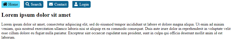
Example ends
Mobile emulator view at width of 320 pixels
Example begins
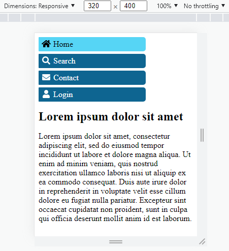
Example ends
Code
View CSS
Code begins
h1 {
   font-size: 1.5rem;
}
#navbar {
   list-style: none;
   margin: 0;
   padding: 0;
}
#navbar a {
   display: block;
   color: white;
   background-color: #0e6591;
   border-radius: 1px 5px 5px 1px;
   padding: 5px;
   text-decoration: none;
}
#navbar a:hover,
#navbar a:focus,
#navbar [aria-current] {
   color: #000000;
   background-color: #56d5f5;
}
#navbar a:hover,
#navbar a:focus {
   text-decoration: underline;
}
/* MEDIA QUERY 1 - For viewports 960px and wider */
@media (min-width: 960px) {
   main,
   nav {
      width: 950px;
      margin: auto;
   }
   main {
      clear: left;
      overflow: auto;
      margin-top: 1rem;
   }
   #navbar {
   }
   #navbar li {
      margin-right: 1em;
      float: left;
   }
   #navbar a {
      padding-right: 0.5em;
   }
}
/* END MEDIA QUERY 1 */
/* MEDIA QUERY 2 - For viewports 959px and narrower */
@media (max-width: 959px) {
   main,
   nav {
      width: 100%;
   }
   #navbar a {
      width: 66%;
      margin-bottom: 5px;
   }
   #navbar a:hover,
   #navbar a:focus {
      border-radius: 5px 25px 25px 5px;
   }
}
/* END MEDIA QUERY 2 */
Code ends
View HTML
Code begins
<head>
   <!-- Loads the fontawesome icons -->
   <script src="https://use.fontawesome.com/releases/v5.15.4/js/all.js" data-auto-a11y="true"></script>
</head>
[…]
<nav>
   <ul id="navbar">
      <li>
         <a href="#" aria-current="page">
            <i class="fa fa-fw fa-home"></i> Home
         </a>
      </li>
      <li>
         <a href="#">
            <i class="fa fa-fw fa-search"></i> Search
         </a>
      </li>
      <li>
         <a href="#">
            <i class="fa fa-fw fa-envelope"></i> Contact
         </a>
      </li>
      <li>
         <a href="#">
            <i class="fa fa-fw fa-user"></i> Login
         </a>
      </li>
   </ul>
</nav>
<main>
   <h1>Lorem ipsum dolor sit amet</h1>
   <p>Lorem ipsum dolor sit amet, consectetur adipiscing elit, sed do eiusmod tempor incididunt ut labore et dolore magna aliqua. Ut enim ad minim veniam, quis nostrud exercitation ullamco laboris nisi ut aliquip ex ea commodo consequat. Duis aute irure dolor in reprehenderit in voluptate velit esse cillum dolore eu fugiat nulla pariatur. Excepteur sint occaecat cupidatat non proident, sunt in culpa qui officia deserunt mollit anim id est laborum.</p>
</main>
Code ends
Related WCAG resources
Related WCAG resources
Success criteria
Techniques
Resize text
Some users with low vision configure their browser’s default text size to be considerably larger.
As per WCAG 2.1 Success Criterion 1.4.4: Resize text, when the design’s text size increases by 200%, ensure there is no overlap or clipping of content, no loss of information or functionality.
This criterion used to require testing your design with the text size (alone) increased to 200%. However, the related WCAG Failure F69 (linked below) was revised to allow testing with basic zoom:
The Working Group has discovered many misunderstandings about how to test this failure. We are planning to revise this failure in a future update. Until then, if the content passes the success criterion using any of the listed sufficient techniques, then it does not meet this failure.
One of the Techniques sufficient to meeting 1.4.4: Resize text is simply using HTML5, for which all modern browsers support zoom (WCAG Technique G142, linked below). The default browser zoom is not text-only zoom, but it is sufficient to meet the Success Criterion. However, mobile designs must still enable pinch-to-zoom, as described in the section Responsive design > Set the viewport.
Related WCAG resources
Related WCAG resources
Success criteria
Techniques
- G142: Using a technology that has commonly-available user agents that support zoom
- C28: Specifying the size of text containers using em units
- G179: Ensuring that there is no loss of content or functionality when the text resizes and text containers do not change their width