Responsive forms
Designing responsive forms
As the viewport changes size, ensure:
- form fields do not overflow, and
- form fields and labels are not separated by wide areas of whitespace. This is a barrier for users with tunnel vision and for users of screen magnification.
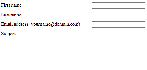
Good example: Responsive form
In this example, a CSS breakpoint at 768px pixels introduces styles for large screens. The essential differences:
- In the small screen view, labels are positioned directly above the control, to maximize screen area for each.
- In the desktop view, labels are positioned to the left of the control, flush right, to maximize vertical space.
Narrow your browser screen to under 768px see the small screen (default) styles.
This example uses WET form HTML (with the addition of a .forms-group class wrapper to the <fieldset> element) but different and simplified CSS to foreground the responsive rules.
Example begins
End of example
View HTML
Code begins
<form action="#" method="get" id="validation-example">
   <div class="form-group">
      <label for="title1" class="required">
         <span class="field-name">Title</span>
         <strong class="required">(required)</strong>
      </label>
      <select class="form-control" id="title1" name="title1" autocomplete="honorific-prefix" required="required">
          <option label="Select a title"></option>
          <option value="dr">Dr.</option>
          <option value="esq">Esq.</option>
          <option value="mr">Mr.</option>
          <option value="ms">Ms.</option>
      </select>
   </div>
   <div class="form-group">
     <label for="fname1" class="required">
         <span class="field-name">First name</span>
         <strong class="required">(required)</strong>
     </label>
     <input class="form-control" id="fname1" name="fname1" type="text" autocomplete="given-name" required="required" data-rule-minlength="2">
   </div>
   <div class="form-group">
     <label for="lname1" class="required">
         <span class="field-name">Last name</span>
         <strong class="required">(required)</strong>
     </label>
     <input class="form-control" id="lname1" name="lname1" type="text" autocomplete="family-name" required="required" data-rule-minlength="2">
   </div>
   <div class="form-group">
     <label for="email1">
         <span class="field-name">Email address</span>
         (yourname@domain.com)
      </label>
     <input class="form-control" id="email1" name="email1" type="email" autocomplete="email">
   </div>
   <div class="form-group">
      <fieldset class="chkbxrdio-grp">
         <legend class="required">
            <span class="field-name">Favourite pets</span>
            <strong class="required">(required)</strong>
         </legend>
         <div class="checkbox">
            <label for="animal1">
               <input type="checkbox" name="animal" value="1" id="animal1">
               Dog
            </label>
         </div>
         <div class="checkbox">
            <label for="animal2">
               <input type="checkbox" name="animal" value="2" id="animal2">
               Cat
            </label>
         </div>
         <div class="checkbox">
            <label for="animal3">
               <input type="checkbox" name="animal" value="3" id="animal3">
               Fish
            </label>
         </div>
         <div class="checkbox">
            <label for="animal4">
               <input type="checkbox" name="animal" value="4" id="animal4">
               Other
            </label>
         </div>
      </fieldset>
   </div>
   <input type="submit" value="Submit" class="btn btn-default">
   <input type="reset" value="Reset page to defaults" class="btn btn-link btn-sm show p-0 mrgn-tp-md">
</form>
Code ends
View CSS
Code begins
.form-group {
   margin-bottom: 1em;
}
strong.required {
   color: #e31c3d;
}
.form-group fieldset {
   max-width: 28em;
}
.form-control {
   display: block;
}
@media screen and (min-width: 768px) {
   .form-group,
   .checkbox {
      clear: left;
   }
   .form-group label,
   .form-group legend {
      float: left;
      width: 18em;
      text-align: right;
   }
   .form-group fieldset label {
      float: none;
      width: auto;
      text-align: left;
      margin-left: 19em;
   }
   .form-control {
      position: relative;
      display: inline-block;
      margin-left: 1em;
   }
   .btn {
      margin-left: 5em;
   }
}
Code ends
Bad example: Non-responsive form
In this example, the labels are positioned to the left of the form fields and aligned left, while the form fields are floated right, creating a large gap between label and form fields. The gap is a barrier for users with tunnel vision or users with low vision who greatly magnify the screen.
Example begins
Example ends